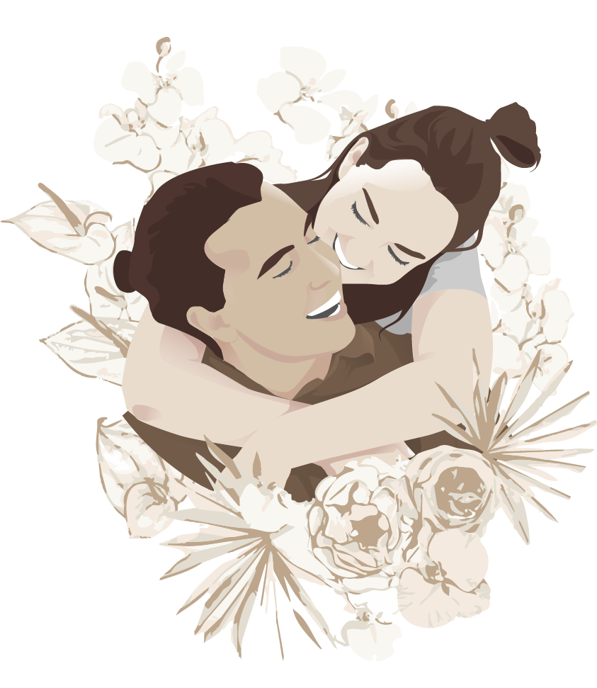
Anyone who has organised a wedding knows guest management is a logistical nightmare. I designed happilyeverhogan as a digitised RSVP website, and as a central hub where guests could find information about our big day.
⠀ ⠀ ⠀
my role
User Research, Prototyping, UX/UI Design
⠀
the opportunity
In November 2019 I proposed to my girlfriend of 10 years and she said yes! We excitedly went to work organising our wedding. As we were designing and sending out our invites we realised there was more information we needed to provide than would fit on the card. As many of our guests live interstate and overseas, we also wanted a quicker method than mail for our guests to RSVP.
the research
Research for this product was an interesting endeavour. It’s not often you can narrow your users down to a specific demographic, let alone the exact 100 people that will be using the product.
Knowing some of our grandparents and older relatives I knew integrating a website to RSVP might be difficult for them, so one of the main goals was to make the website accessible for the tech illiterate.
I presented other wedding RSVP websites to my mother and aunty to gage where the stumbling blocks with those websites were. They were often scared off by navigating unfamiliar menus, and often had trouble wayfinding to relevant details.
how might a wedding website be as familiar as possible to my older relatives?
⠀ ⠀ ⠀ ⠀ ⠀
design solutions
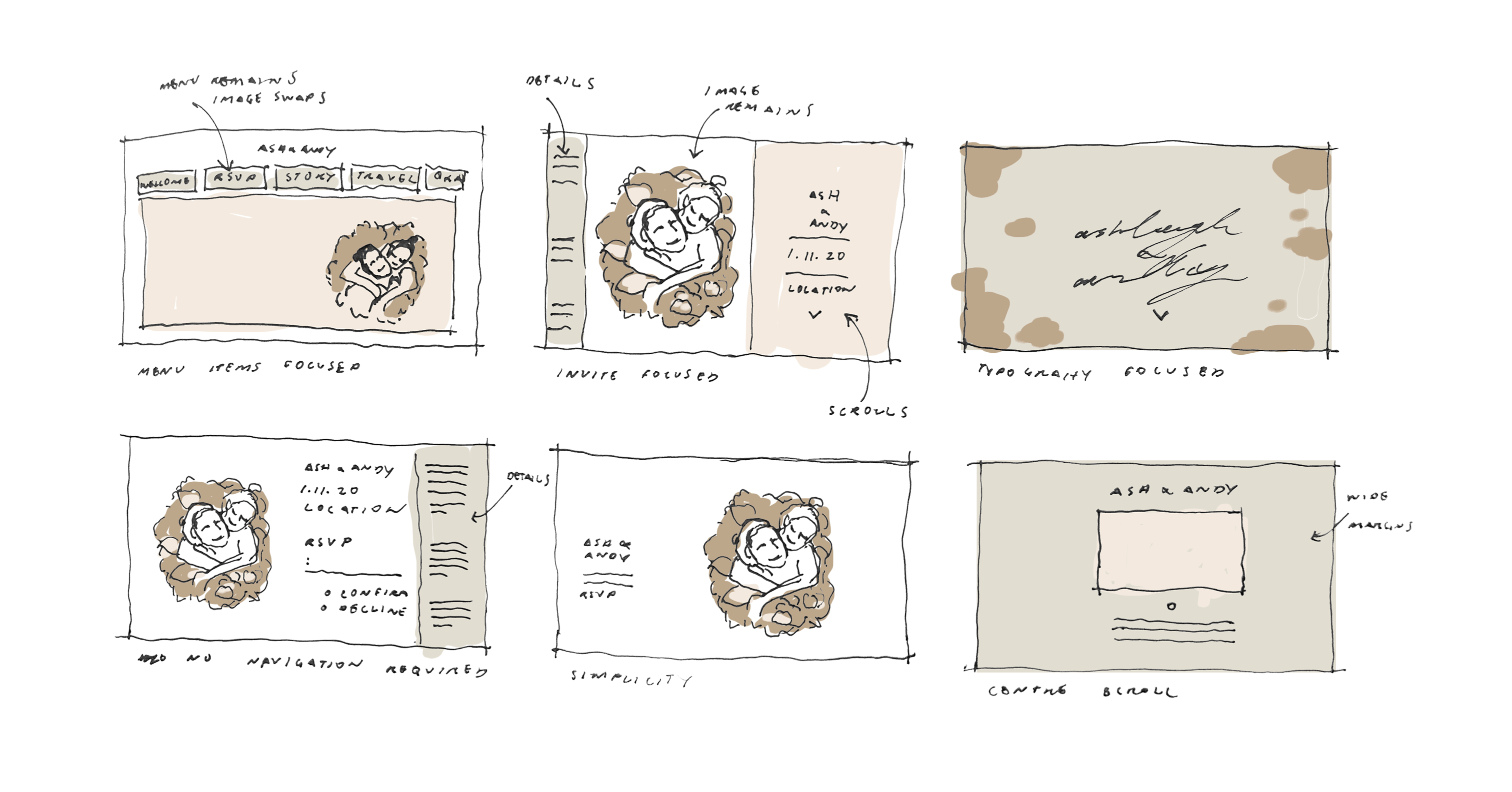
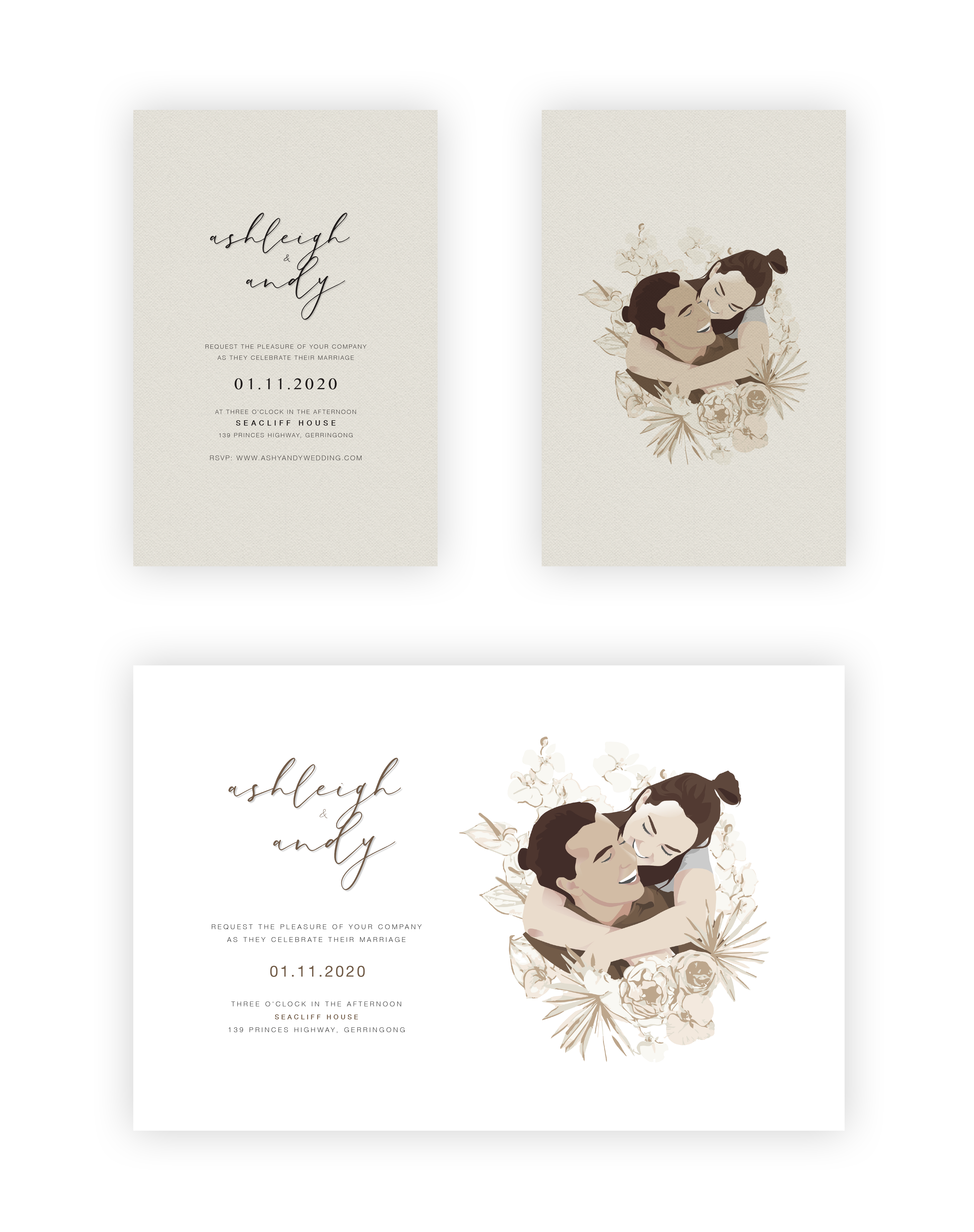
The solution was to design the website to look and function as a digital version of the paper invite that the guests would receive. By adopting this conceptual model I hoped the older relatives would be familiar with how to to interact with the website, and in turn it could help me to make consistent design decisions.
For instance it was important that the website function as a singular page with no menus or additional pages — as if it was one long piece of paper. That way it would be virtually impossible for the my grandparents to get ‘lost’ navigating through menus. Basing the website off the paper invite also meant the website would have a sense of branding and consistency
⠀ ⠀ ⠀ ⠀ ⠀ ⠀
The website uses the paper invite as a conceptual model to provide familiarity for older users and to inform design direction
user testing
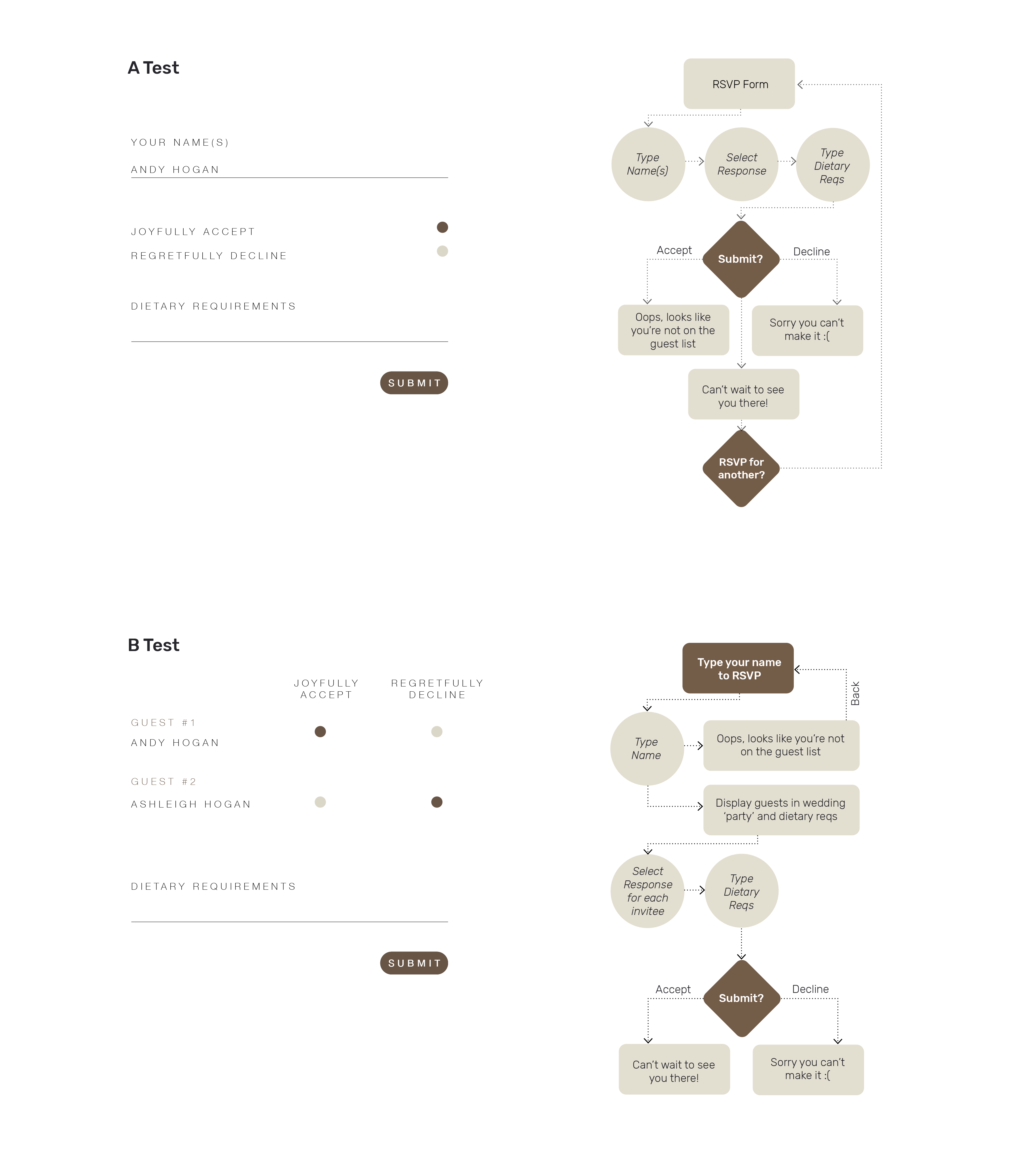
An important user flow was the actual RSVP form. I broke down the steps of filing out the form to make sure each step in the flow was accounted for.
One important insight from the user testing was that as many of the invitees would respond as a group, and because of this it was important that the site could RSVP for multiple people.
For example if my aunty wanted to RSVP for her husband and kids, it wouldn’t be desirable to have to track back and RSVP for each person individually, so the user flow was tweaked to design for this.