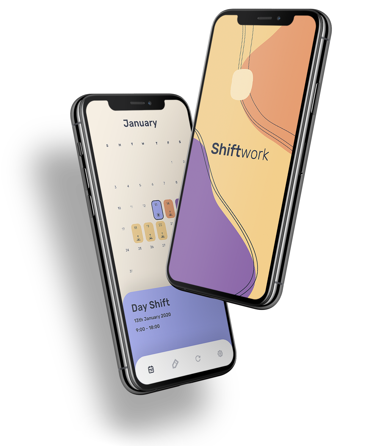
Shiftworkers commonly receive rosters as a paper printout, which can easily be misplaced. I designed shiftwork as a simple way to store irregular shift cycles in the native phone calendar.
⠀
my role
Product Designer, UX UI Designer
⠀
the opportunity
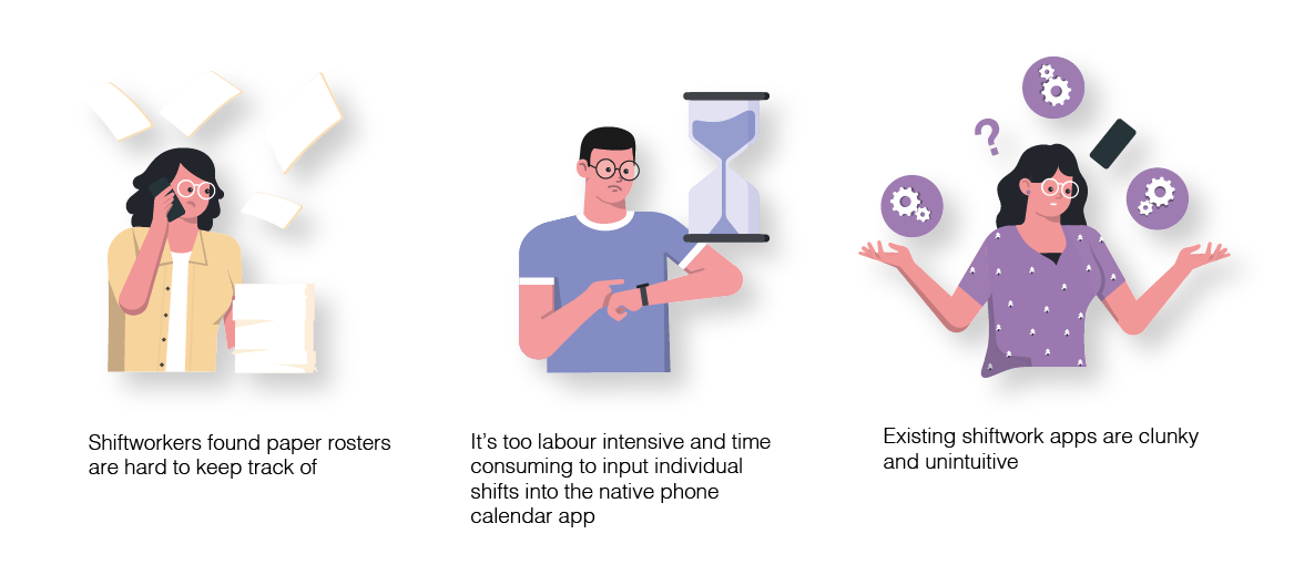
At the outbreak of covid-19 my housemate took a job as a wardsman in the corona ward. The only place to find his roster was on a physical printout in the office and he was often frustrated at keeping track of his shift allocations. He often found himself calling the hospital to have someone read if he was on a morning, afternoon or night shift the next day.
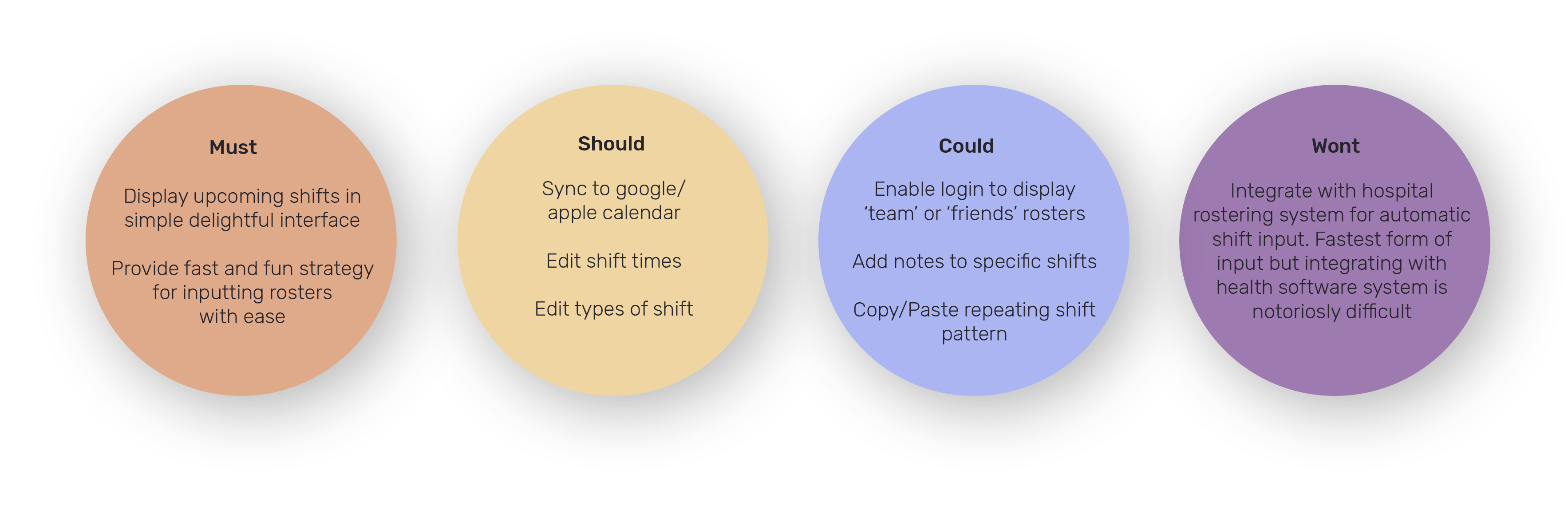
My goal was to design an app that could help shiftworkers track their roster with ease.
the research
I wanted to gain a better insight into how most shiftworkers were tracking their rosters. I interviewed 4 nurses, 5 midwives and 1 wardsmen.
100% of those interviewed found and tracking shifts was an arduous task Rosters were distributed as a physical printout, or accessed through a clunky online portal. 90% of those interviewed used their phones to store a version of their roster. 60% of those interviewed were using shiftwork specific calendar apps to manually input the roster
⠀
Most shiftworkers weren’t using the native calendar app in their phones because of how laborious it was to input shifts. Traditional calendar apps need to be comprehensive and flexible enough to design for an infinite variety of event types.
To manually enter a months worth of shifts day by day was just too time consuming. The third party calendar apps were clunky and unintuitive to use. They were either bloated with unessesary features or lacking crucial ones.
How might users rapidly input rosters? How might users quickly identify upcoming shifts?
⠀
design solutions
The first step was to remove all the detail involved in a traditional calendar app that was not required for shiftworkers.
There are essentially 4 types of shifts — morning, day, afternoon and night shift. If the app restricted input to just these 4 types, these could essentially be ‘stamped’ to a day to mark upcoming shifts. This became the basis for the speedy and intuitive input process.
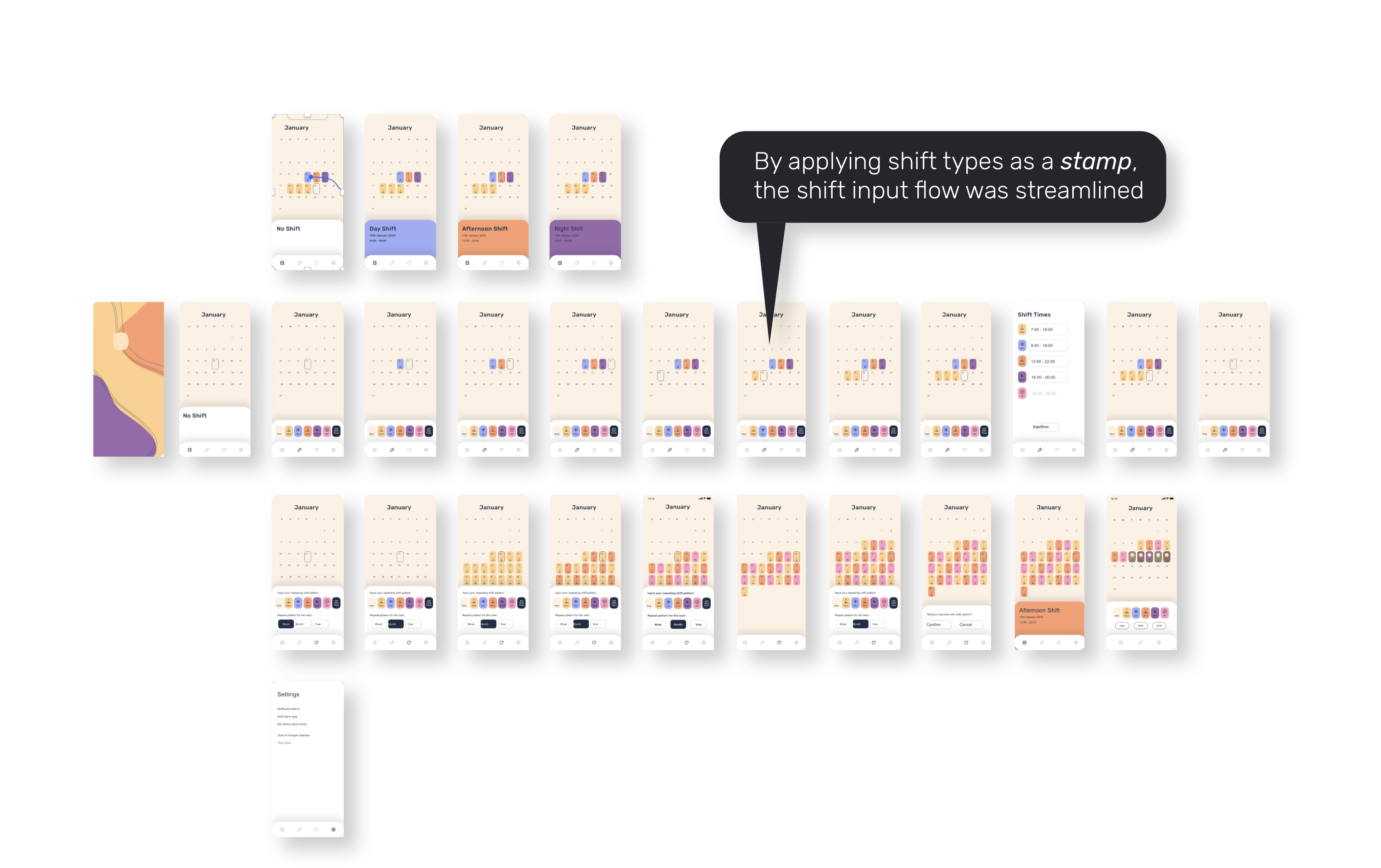
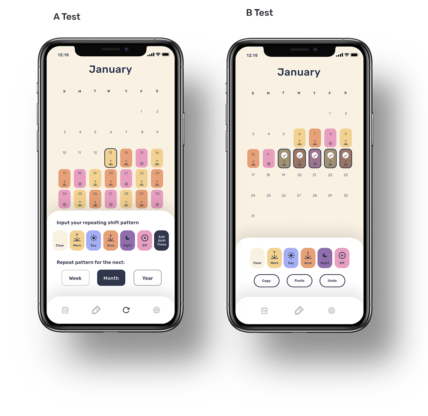
user testing
I trialed prototypes on the same testing group to identify any problems with the user flow. I found that users were getting confused with ‘selecting’ a stamp and then clicking a date in order to apply it.
The most streamlined method emerged, which was to have a default ‘cursor’ on the calendar and any stamp pressed would apply the shift type to the cursor location.
I AB tested a ‘repeat shift pattern’ function which was designed for rosters that had the same shift pattern for multiple weeks in a row.
I found that having different pages for ‘edit single shift’ and ‘edit multiple shifts’ was confusing to the users. The design needed to revolve around a single ‘edit’ card which housed all the editing features.
⠀